Deelishious - Ice Cream Company
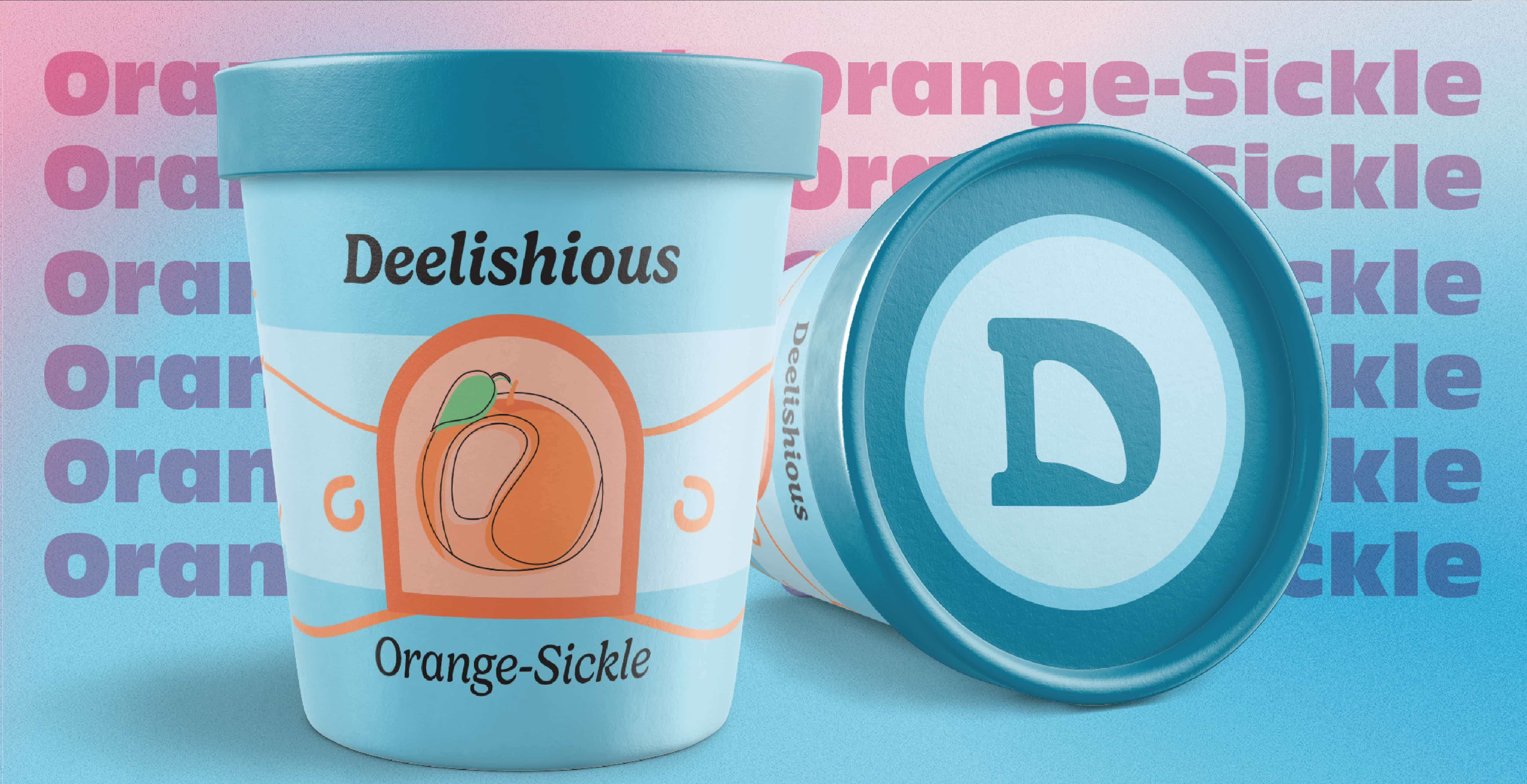
Deelishious was inspired by local ice cream shops, I began this project because I wanted to practice and improve my skills in branding and logo design as I am more familiar with these skillsets. But I also wanted to learn new skills in package design along with creating social media posts to promote the company and its products.
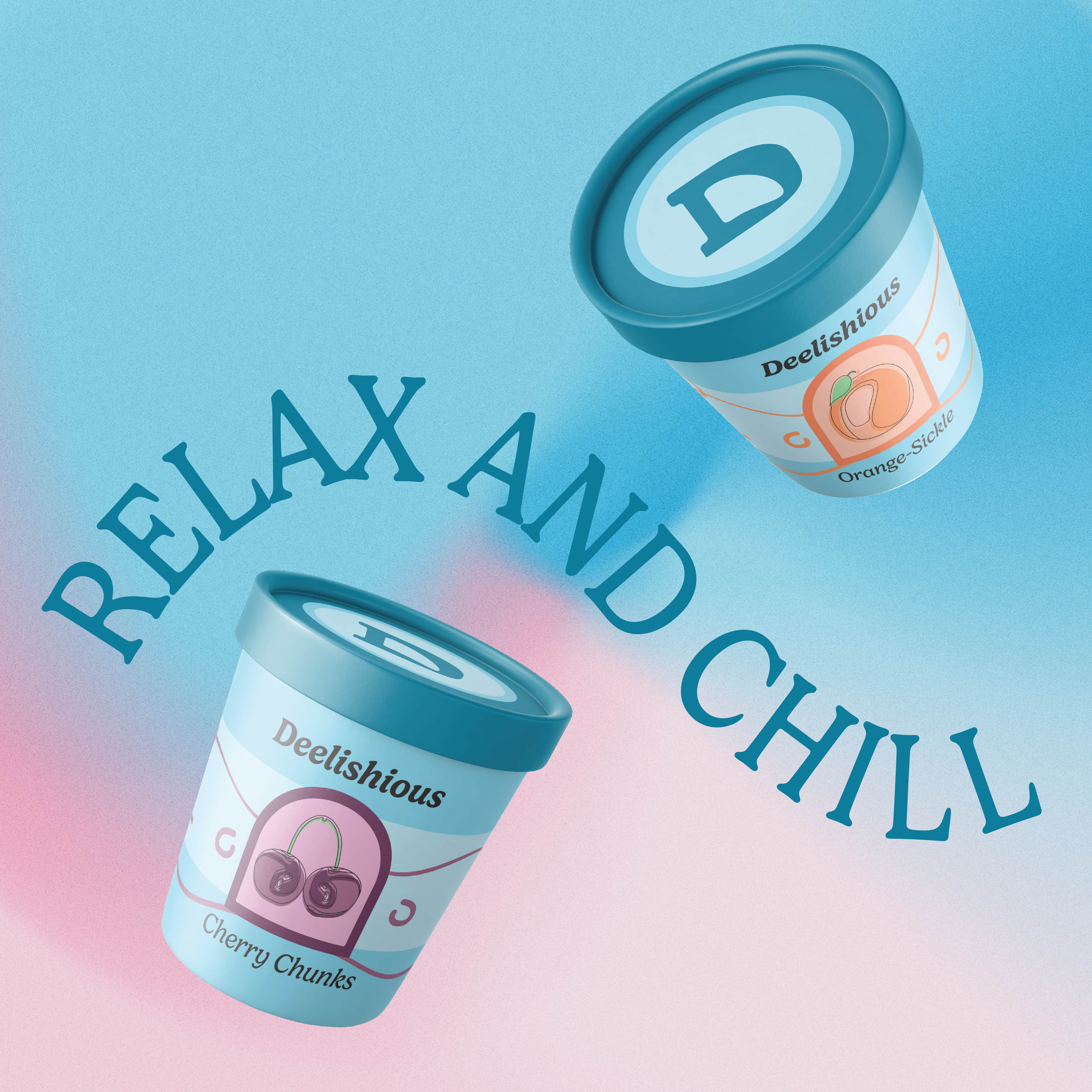
While I was creating the brand guidelines for this fictional ice cream company I wanted the design them to be consistently playful and lighthearted. I chose blue as the primary colour and pink as the secondary because blue represents loyalty and has the effects of calmness and relaxation while the colour pink can influence relaxation and sugar cravings. This combination expresses that the company is trustworthy and will help you relax and unwind after a long day.
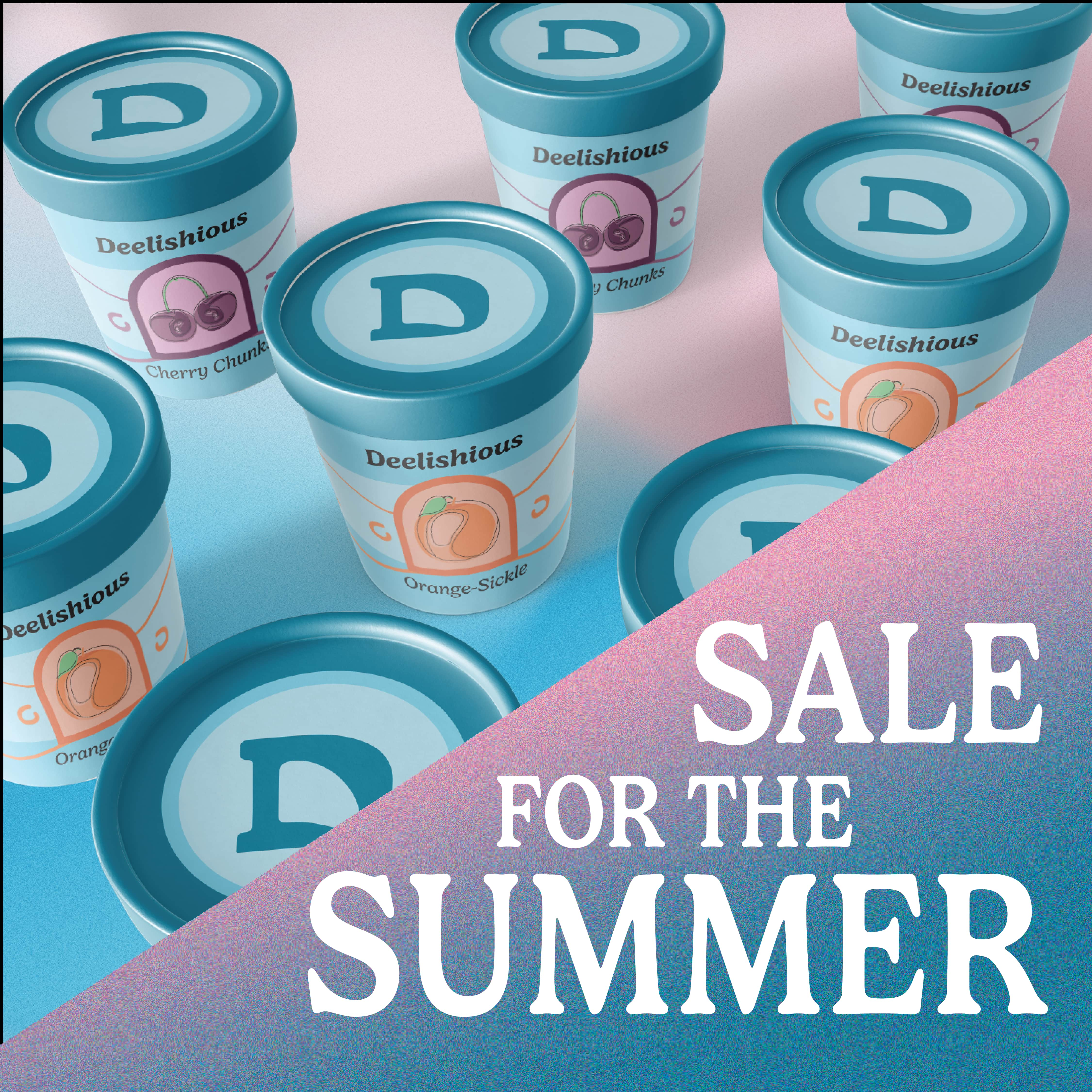
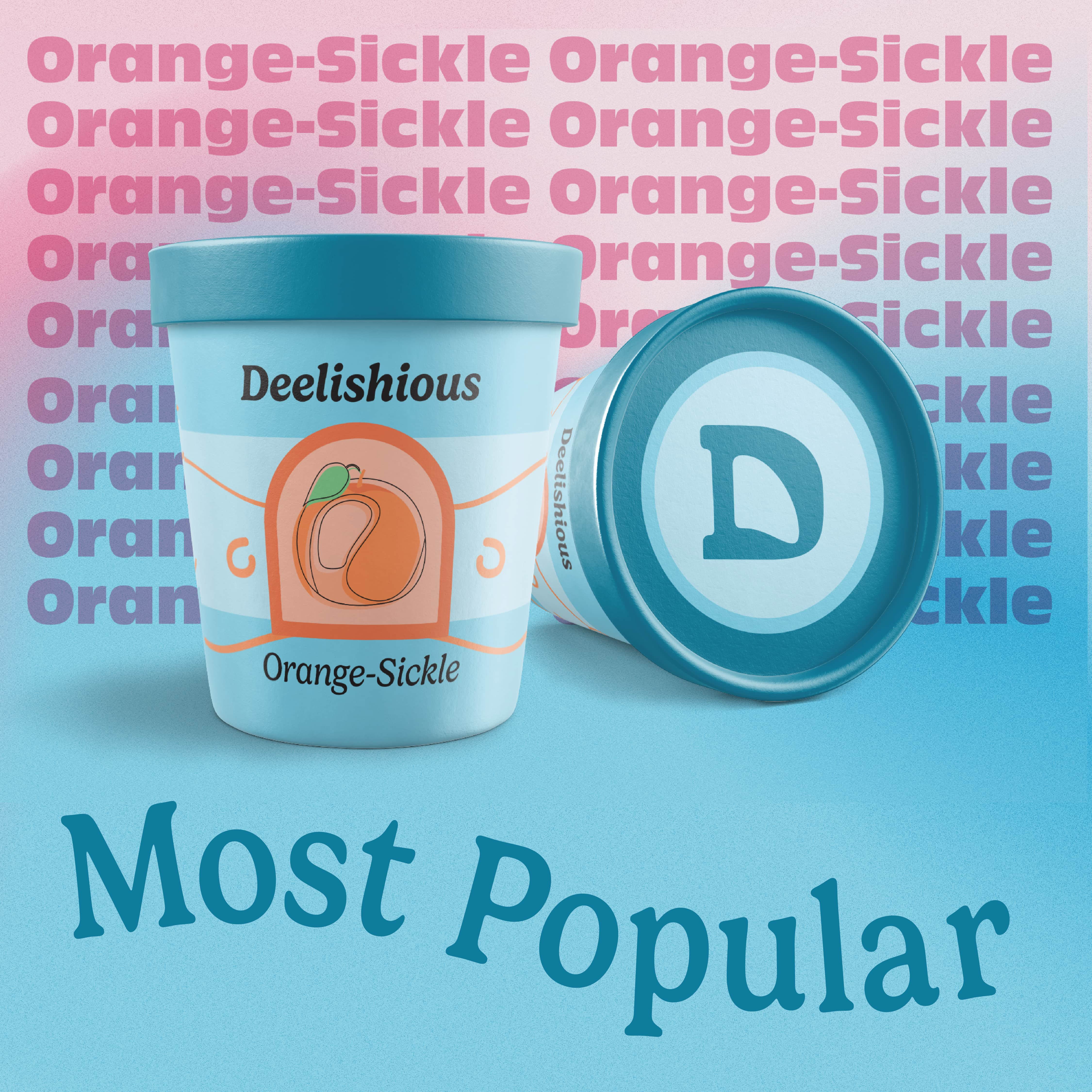

Project Type:
Logo Design and Brand Standards
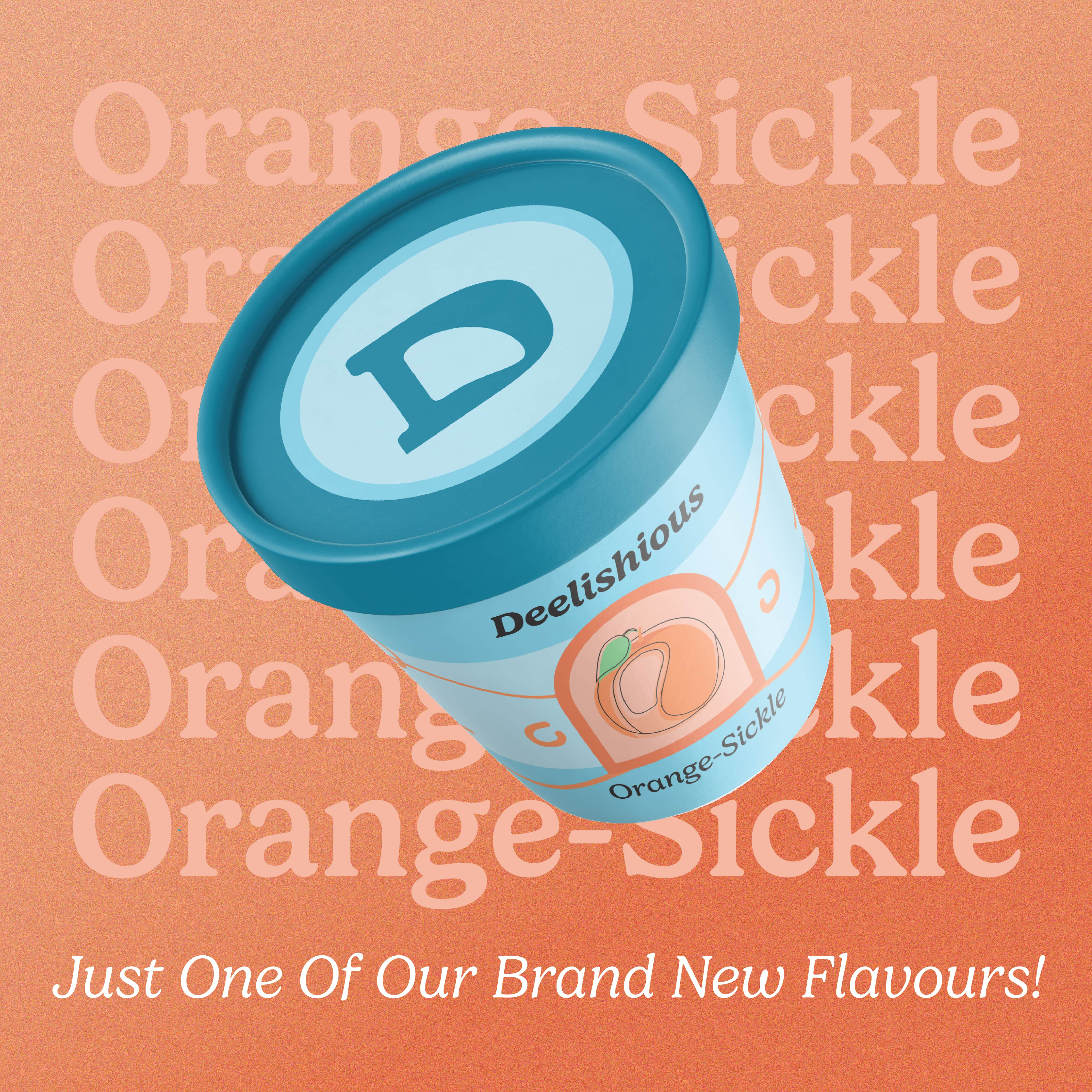
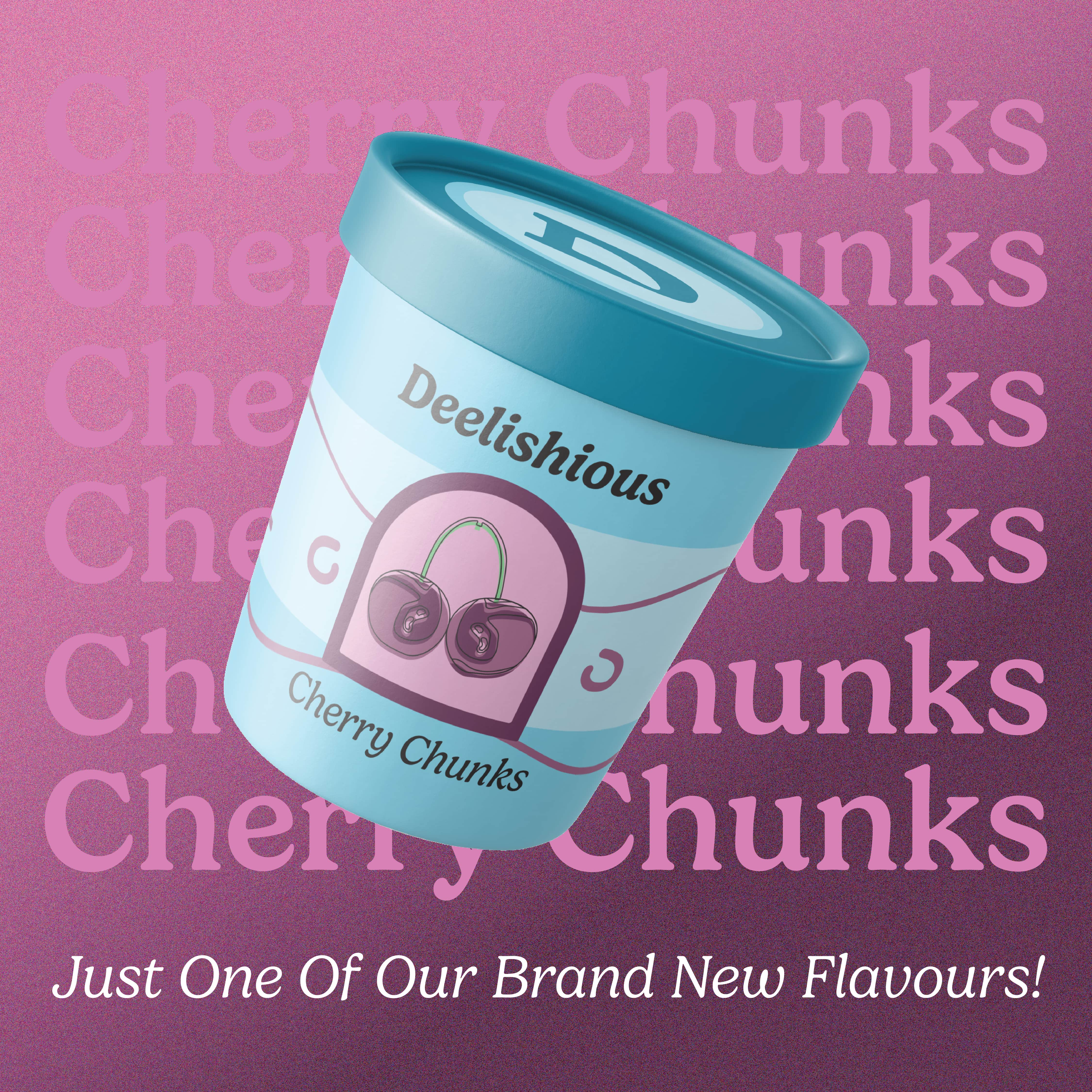
Social Media Campaign
Tools Used:
Adobe Illustrator
Adobe Photoshop
Adobe After Effects
Intention:
Personal
Year:
2023
